Periodically I’ll spotlight cool stuff being done by Dothraki community members here on the blog. Today I want to take a look at something really cool done by Dothraki.org member Qvaak.
Prior to the Fourth Language Creation Conference, attendees took part in the LCC4 Conlang Relay. To start the relay off, I provided a text in Dothraki about an incorrigible goat.
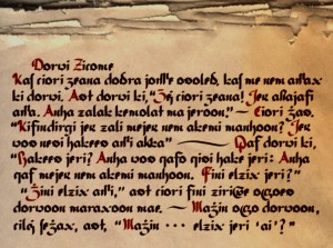
That was pretty much the end of the story, until recently, when I got a tweet about the existence of a possible orthography for Dothraki. The tweet linked to the following image:

Check that out! That’s the text of my leg of the relay written in a modified romanization designed for Dothraki by Qvaak. Pretty cool! Here’s a summary of the changes that were made with commentary:
- y > j: Probably doesn’t make a lot of sense to English speakers, but this is common enough in European languages (e.g. German, Dutch, Finnish, etc.).
- ch > c: It seems that one of Qvaak‘s goals here was to remove all the digraphs, which is a good idea, generally, but something I didn’t want to do for (primarily) English-speaking actors. For example, if chomat was spelled comat, no English speaker would pronounce it correctly.
- sh > ſ: Now we didn’t see any examples of a capital sh, so I’m not sure if Qvaak uses a different character for the upper case version, but this one (kind of like a barless “f”) is used for a lower case long “s” in some languages. If you want a whole character and not an “s” with a diacritic, this is a good choice. (Update: The actual character is ʃ, which is the same as the phonetic character, and also what you see in older English texts and elsewhere for lower case “s” in certain places.)
- kh > x: When I create romanization systems for my own languages, I always use “x” for [x]. I couldn’t do it here, though, because “x”, to an English speaker, is [ks]. This is a good, uncontroversial change.
- th > δ: Qvaak, you’ll have to forgive me if I got the wrong character, but that looks like a Greek lower case delta, as opposed to ð, which is a lower case eth. This change is rather controversial, in my opinion—and it’s always tough to choose a glyph when you need to represent [θ] in a romanization. In the history of English, we used þ, which looks an awful lot like p. The character used here looks an awful lot like d—which, at least, will get you closer to the correct sound, but may be confused by readers without a d to compare it to. Looks neat, though!
- zh > ʒ: Love it. One of my favorite sounds, and one of my favorite Latin characters.
- j > ʒ̇: I like the way this character looks a lot, but unless I’m missing something, it can’t be represented by a single Unicode character. What I had to do was use ʒ with a combining dot above (so if you see a strange box or something after the ʒ, it’s supposed to be a dot above it). Too bad, because I think the look of the character is just right. (Update: According to Qvaak, this character is actually ǯ [an ezh with a caron], which is used in the world’s languages; the caron just becomes a dot in the calligraphic form.)
- ‘ > Ø: Of course, the apostrophes to indicate contractions are optional, anyway, so removing them helps to make the text look less cluttered. Good decision.
- Geminate > Ligature: Some of the absolute coolest characters in this text are the geminate ligatures (geminate s is my favorite, with geminate g a close second). Very cool! Makes me wish I’d included more in the relay text so we could see what they look like. (No double vowel ligatures, though?)
Now, of course, this wouldn’t work for Dothraki in the Song of Ice and Fire universe, since: (a) we know the Dothraki have no written form for their language, and (b) it’d be too incredible a coincidence for an orthography to develop naturally using the exact same glyphs that are used in the roman alphabet in our world. But in our universe, I have to say, it looks pretty good!
So, perhaps the question we should ask now is: Where’s the font, Qvaak? ![]()
Great job! Totally love it.
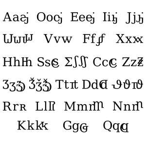
Update: Qvaak has provided us with another image of the characters in the font in a more typographic style. It’s shown below:

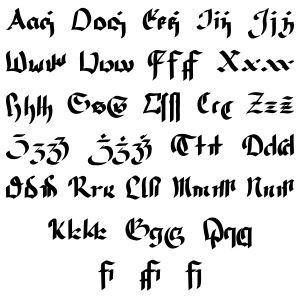
And here’s the calligraphic version of the script:

Also, for some feedback from Qvaak himself, check out his lengthy comment below.

Man, this’ll be a long “comment”.
First of all, the official ortography is amazingly good. I think it makes all the right choices: it strives to be phonemic, intuitive and keyboard-friendly and delivers on all accounts.
I still found a cart-load of reasons to mess with an alternative ortography. To name a few:
1) An ambigrammist and a general typography hobbyist, I’m always looking for excuses to experiment with glyphs. If you wondered, why I went on a mad ligature-spree, this is why.
2) I feel that Dothraki benefits greatly from the fact that it’s diegetically spoken nearly exclusively by one nomadic people having no written language and somewhat culturally isolationistic attitude; it is sharply defined and graspable – one might expect it to become much more fully realised than some world-spanning language like Valyrian ever might. The lack of the writing system is one of the main points on this vein. ..And thus I wanted to detach the language from the written form, both in my head and as a subtle statement to my peers. Creating a competing bastard writing system (even a one that offers no real competition) felt like a fun way to undermine the equation between the written words and the spoken language behind the words.
3) There are always compromises. I felt I could actually achive better results on some regards. Namely: I could make the ortography more finn-friendly (by letting it slip to less English-friendly) and make the written words more readily communicative of spoken-word length and complexity (losing digraphs by sacrificing the ascii-friendliness … Well, I was sacrificing ascii-friendliness anyway for my personal amusement’s sake, so this was kinda freebie).
As for the details:
The letter I chose for j-sound is just an ezh with a caron. That actually represents the j-sound in some languages, I read. The font was made with my usual half-arsed test-attitude, hand-drawn with a tablet, and to clean off all the little ugliness in details, I let the letters go thorugh a crude mauling procedure. The caron got looking like a dot, but I felt the glyph was no worse for it.
The symbols I use for th-sound borrow from theta, delta and latin d. The small letter used in the text is actually identical to the d-glyph of the fraktur lettering I based my font on – the glyph I use for the dothraki d-sound is a modernisized version. ..Somewhat dramatically simplified story about historical Finnish tells, that we had the th-sound, but when we got our writing system, the ortography for th-sound was “d”, and teachers and reading/writing high society – being heavily influenced by Swedish and German – started pronouncing and teaching as they saw written, and the th-sound was lost. So there is a close-to-my-heart historic precedence for this ortographic choice.
There was some talk about geminates on the forum – eventually resulting in the question being the first on this blog. I thought it would be nice to underline the fact that they aren’t fully stutter-like doubled, but rather pronounced in a longer, bigger way. As far as I understand, they divide into two syllabes, though, so it might be argued that the consonant clusters that fit into syllabe onset or coda would make more sense to ligaturize. Oh well.
The vowels are pronounced more individually than I’m used to, so geminating them would have been counterproductive. As far as I know, a vowel followed with y-glide is the only diphthong in Dothraki – and even there I’m guessing if the y is followed by a vowel, it jups to onset and breaks the diphthong. Still, I made the ligatures there, too.
As for the ortography being compatible or incompatible with the SoI&F-verse… To get it to comfortably fit, I think you’d need to subscribe to rather controversial opinion (or feel, midset, interpretation … to which I subscribe, accidentally) that Westerosi coincides with GRRM’s (and consequetly the series’) English in pronunciation and writing. Then it would be quite trivial (if unnecessary and in discord with GRRM’s dislike of fan fic) to spin a tale of a dothraki person far from home meeting an eccentric ethnographically motivated maester..
It’s unlikely the font would be truly created. Drawing a bunch of glyphs is one thing, running them through a font program an another thing. I’ve tried once. ..But all the letters are there, yes.
Uhh. There. Let’s see how this goes into a comment-box.
Thanks for the explanation! I’ll include that second image in the post (and refer to your comment). I didn’t know that about Finnish! I’d heard it had (or has in some dialects…?) [θ] or [ð]; didn’t know the circumstances. Many linguists claim that writing has no effect on the course of a language (i.e. sounds will change of their own accord), but there are too many counterexamples to take that at face value. Nice to know of this one!
Hey, I don’t know if you’ve heard of it or toyed around with it before, but you should check out Fontstruct.com. You can make your own fonts, download them, share them, etc., and it’s all online—and all free! You might be able to fontify this using that.
I messed the link format. Silly me. There was a third picture. This one.
Your link doesn’t work, either, but the page was easy enough to find. Fonstruct seems nice. I doesn’t seem willing to eat my .svg’s, but nice. I think I’ll still hang on the idea that some day I’ll learn a full font-creation tool (Fonforge, probably).
Oh, oops. Link works now. Thanks for the other picture! I’ll add it to the post, too.
Aww, and I thought it’d explain the Devanāgarī-like writing in the header
There’s not an extremely interesting explanation for that, but since I’ve gotten that question three times, I guess I’d better explain it. Will do!
I would like to hear the Dothraki story of the woman and the goat read aloud in a sound file.
Perhaps down the line I’ll put it up with a sound file.
Speaking of which…How is it going with isolating the talks from LCC4 into youtube videos?